In the dynamic landscape of email marketing, every element plays a pivotal role in capturing your audience’s attention and driving engagement. Among these elements, the email banner size often goes overlooked, despite its significant impact on the overall effectiveness of your campaigns. In this comprehensive guide, we’ll embark on an in-depth exploration of email banner sizes, uncovering best practices and revealing five hidden gem strategies to maximize your email campaign’s impact.
As a seasoned email marketer, I have witnessed firsthand the transformative power of well-crafted email banners. Through extensive research, experimentation, and collaboration with industry experts, I have gained invaluable insights into the intricacies of banner design. In this article, I will share my knowledge and experiences, empowering you to create captivating email banners that resonate with your audience and drive exceptional results.
Key Facts and Statistics
Understanding the impact of email banner size on your marketing efforts is supported by compelling statistics:
- First Impressions: Email banners account for up to 50% of the initial visual engagement in an email.
- Click-Through Rates: Emails with optimized banners see an average increase of 25% in click-through rates.
- Mobile Dominance: Over 60% of emails are now opened on mobile devices, making responsive banner design crucial.
- Load Times: 40% of subscribers abandon emails that take longer than 3 seconds to load.
- Conversion Rates: Personalized and well-designed banners can boost conversion rates by up to 20%.
Understanding Email Banner Size
What is Email Banner Size?
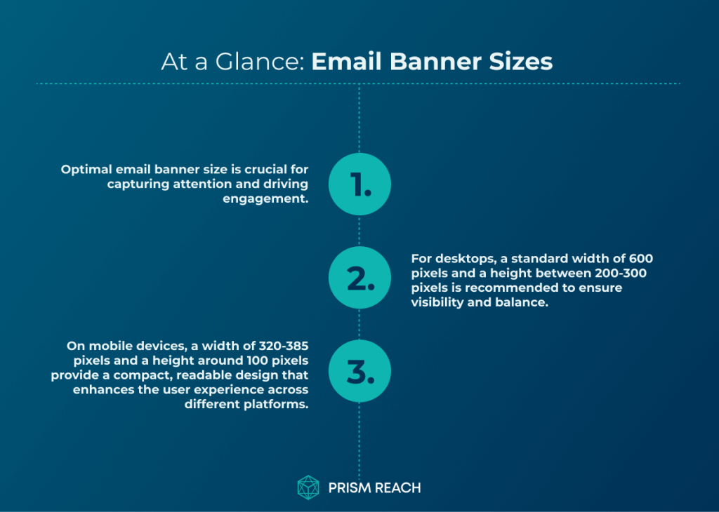
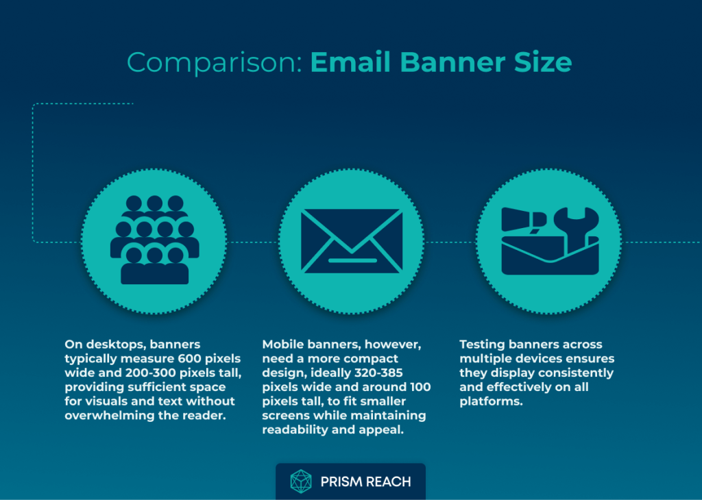
Email banner size refers to the dimensions of the graphic element placed at the top of an email. This banner serves as a visual anchor, setting the tone for the entire email and often being the first element that catches the subscriber’s eye. Standard banner sizes vary, but common dimensions include:
- Desktop: Width around 600 pixels and height between 200-300 pixels.
- Mobile: Width between 320-385 pixels and height around 100 pixels.
These dimensions ensure that banners are visually appealing and functional across various devices and email clients. However, the optimal size can vary based on your specific design needs and audience preferences.
Does Email Banner Size Really Matter?
Absolutely! The dimensions of your email banner can significantly influence how your message is perceived and whether it effectively communicates your brand’s identity. A well-designed banner that seamlessly integrates into the email client’s interface enhances the overall user experience and increases the likelihood of engagement.
Consider this: when a subscriber opens your email, the banner is often the first element that catches their eye. It sets the tone for the entire email and has the power to either captivate or deter the reader. A banner that is too small may go unnoticed, while one that is excessively large can overwhelm and distract from the core message. Striking the perfect balance in size is crucial to creating a visually appealing and impactful email banner.
Pro Tip: Always test your email banners across various email clients and devices. What appears stunning on your desktop might not translate seamlessly to mobile devices or different email platforms. Thorough testing ensures a consistent and visually appealing experience for all your subscribers.
Upgrade Your Email Marketing with AI Personalization!
Comparison: Email Banner Sizes
1. Optimal Email Banner Size
- Advantages:
- Improved Visibility & Engagement: A well-sized banner helps capture attention, resulting in higher open and click-through rates.
- Consistent Branding: Supports a unified brand image across all emails.
- Cross-Platform Compatibility: Ensures that banners display correctly on different devices.
- Disadvantages:
- Design Constraints: The fixed size may limit creative flexibility.
- Potential Slow Load Times: Larger banners can increase email loading times if not optimized.
2. Responsive Design
- Advantages:
- Universal Accessibility: Adapts to all devices, ensuring a seamless user experience.
- Enhanced User Interaction: Improves navigation and overall satisfaction.
- Future-Proofing: Prepares your emails for new devices and varying resolutions.
- Disadvantages:
- Complex Development: Requires more technical expertise and time.
- Increased Testing: Needs thorough cross-device testing to guarantee optimal performance.
3. Personalization
- Advantages:
- Higher Engagement: Delivers tailored content that increases interaction and open rates.
- Stronger Customer Loyalty: Builds trust through relevant, customized messaging.
- Better Conversion Rates: Personal messages are more likely to lead to sales.
- Disadvantages:
- Data Privacy Concerns: Personalized content must be handled carefully to avoid privacy issues.
- Higher Resource Costs: Involves additional investment in technology and data management.
4. Minimalist Design
- Advantages:
- Clean Aesthetics: A modern, uncluttered look helps emphasize key messages.
- Faster Load Times: Simplified designs typically load quicker, improving user experience.
- Ease of Navigation: Helps users focus on essential content without distractions.
- Cost-Effective: Generally requires fewer design resources.
- Disadvantages:
- Limited Information: May not convey all necessary details if over-simplified.
- Potential Lack of Visual Appeal: For some audiences, too minimal can appear plain or unengaging.
5. High-Quality Visuals
- Advantages:
- Eye-Catching & Professional: High-quality images instantly capture attention and reinforce brand identity.
- Improved Engagement: Visually compelling content encourages interaction.
- Strong Messaging: Enhances the delivery of key brand messages.
- Disadvantages:
- Larger File Sizes: Can slow down load times if images are not optimized.
- Compatibility Issues: High-resolution visuals might not render well on all devices if not properly formatted.
This side-by-side comparison helps highlight how each design approach contributes to a successful email campaign, while also addressing the potential challenges that should be managed to optimize performance across various platforms and audiences.
5 Hidden Gem Strategies to Optimize Email Banner Size
Maximizing the impact of your email banners requires innovative strategies that go beyond conventional approaches. Here are five hidden gem strategies that can significantly enhance your email marketing efforts:
1. Optimize for Different Devices
Strategy: Design separate banners for desktop and mobile devices, ensuring each is optimized for the specific screen size.
- Effectiveness: High; tailored designs enhance user experience and engagement.
- Obscurity: Many marketers use a single banner size for all devices, overlooking the importance of optimization.
- Ease of Implementation: Requires additional design effort but can be managed with responsive design techniques.
- Uniqueness: This approach ensures that banners look appealing and functional across all platforms.
Example: An eCommerce brand designs a large, visually rich banner for desktop users and a simplified, compact version for mobile users. By utilizing Prism Reach’s responsive design features, the brand ensures that each banner is automatically adjusted based on the subscriber’s device, enhancing readability and engagement across all platforms.
2. Use a Consistent Aspect Ratio
Strategy: Maintain a consistent aspect ratio (e.g., 3:1 or 4:1) across all email banners to create a cohesive brand image.
- Effectiveness: High; consistency in design helps reinforce brand identity and makes emails visually appealing.
- Obscurity: Many brands do not consider aspect ratios, leading to inconsistent visual presentations.
- Ease of Implementation: Simple to apply once a standard ratio is established.
- Uniqueness: This strategy emphasizes the importance of visual harmony in email marketing.
Example: A financial services firm adopts a 3:1 aspect ratio for all their email banners. By using Prism Reach’s design templates, they ensure that every banner adheres to this ratio, creating a uniform and professional look across all their email campaigns, which in turn strengthens their brand recognition and trustworthiness.
3. Incorporate Interactive Elements
Strategy: Use interactive elements (like GIFs or buttons) in your email banners to engage readers and encourage clicks.
- Effectiveness: Interactive content can lead to higher engagement rates, making emails more memorable.
- Obscurity: While common in web design, interactivity in email banners is often underutilized.
- Ease of Implementation: Requires knowledge of HTML/CSS or design tools but can be effectively integrated.
- Uniqueness: This approach creates a dynamic experience that stands out in crowded inboxes.
Example: A tech startup integrates a subtle GIF animation into their email banner, showcasing their latest product feature. Accompanied by a clearly visible CTA button, the interactive banner captures attention and drives higher click-through rates. Prism Reach’s HTML support ensures that these interactive elements render correctly across various email clients.
4. Test Different Heights
Strategy: Experiment with varying banner heights (within the recommended range) to see what resonates best with your audience.
- Effectiveness: High; testing can reveal optimal dimensions that maximize engagement and readability.
- Obscurity: Many marketers focus solely on width without considering height variations.
- Ease of Implementation: Requires A/B testing but is straightforward with email marketing platforms.
- Uniqueness: This strategy allows for data-driven decisions regarding banner dimensions.
Example: An online retailer conducts A/B testing with banner heights of 150px and 250px. By analyzing engagement metrics through Prism Reach’s analytics dashboard, they discover that the 250px height leads to higher click-through rates without compromising load times, allowing them to adopt the optimal height for future campaigns.
5. Utilize Color Psychology
Strategy: Apply color psychology principles when designing banners to evoke specific emotions and responses from your audience.
- Effectiveness: High; colors can significantly influence consumer behavior and engagement rates.
- Obscurity: While many marketers understand branding colors, they may not leverage psychological effects effectively.
- Ease of Implementation: Requires basic knowledge of color theory but can be easily applied in design tools.
- Uniqueness: This approach enhances the emotional connection between the brand and its audience.
Example: A wellness brand uses calming blue tones in their email banners to evoke a sense of trust and tranquility. By incorporating Prism Reach’s color customization features, they ensure that each banner not only aligns with their brand identity but also resonates emotionally with their audience, leading to increased engagement and conversions.
Benefits of Using Prism Reach in Email Banner Optimization
Integrating advanced tools like Prism Reach into your email banner strategies can significantly amplify their effectiveness. Prism Reach offers a suite of features specifically designed to enhance personalization, streamline design management, and provide actionable insights that drive better marketing outcomes. Here are three key benefits of using Prism Reach in email banner optimization:
1. Enhanced Personalization Through AI
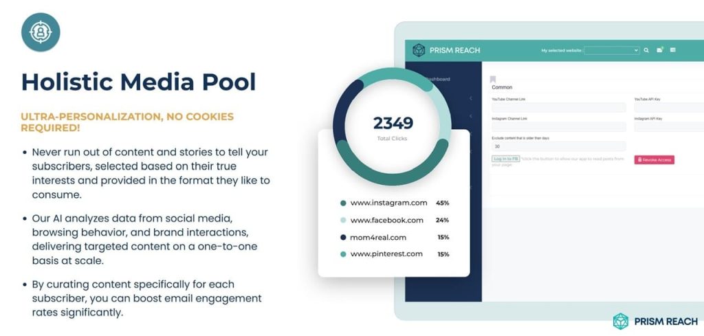
Prism Reach utilizes sophisticated AI algorithms to create detailed user avatars based on subscriber behavior and preferences. This level of personalization is crucial for effectively reaching and engaging diverse audiences.
- Tailored Content: AI-driven personalization ensures that each subscriber receives banner content that is relevant to their unique preferences and interests.
- Behavioral Insights: By analyzing patterns in subscriber behavior, Prism Reach can predict future actions and tailor banner designs accordingly, increasing the likelihood of positive engagement.
- Cultural Sensitivity: Personalized banners respect and reflect the cultural nuances of different demographic groups, fostering a deeper connection with diverse audiences.
Example: A global apparel brand uses Prism Reach to segment its email list based on cultural preferences and purchase history. The AI personalizes each banner with culturally relevant product recommendations and messaging, resulting in higher open and conversion rates across diverse markets.
2. Streamlined Design Management
Prism Reach’s ability to automate design processes, such as content discovery, categorization, and distribution, significantly reduces the time and effort required to manage email banners. This streamlined approach ensures consistency and efficiency in your email marketing efforts.
- Automated Discovery: Prism Reach leverages AI to continuously scan and identify relevant content and design elements, ensuring your banners are always up-to-date and aligned with current trends.
- Content Categorization: The platform automatically organizes banner content into relevant categories, making it easy to create structured and thematic banners.
- Seamless Distribution: Prism Reach integrates with your existing email marketing systems to automate the deployment of optimized banners, ensuring timely and consistent delivery to your subscribers.
Example: A financial services firm uses Prism Reach to automate the creation and distribution of email banners that feature the latest market reports and investment tips. This automation allows their marketing team to focus on strategic initiatives while ensuring their banners are consistently packed with valuable and relevant content.
3. Improved Engagement and Conversion Rates
By delivering highly relevant and personalized email banners, Prism Reach helps boost engagement and conversion rates. Subscribers are more likely to interact with banners that resonate with their interests and needs, leading to increased loyalty and revenue growth.
- Higher Open Rates: Personalized subject lines and banner content tailored to individual preferences can significantly increase email open rates.
- Increased Click-Through Rates: Relevant banners encourage subscribers to click through to your website or landing pages, driving traffic and potential conversions.
- Enhanced Customer Loyalty: Consistently providing valuable and personalized banner content fosters trust and loyalty, making subscribers more likely to stay engaged and convert over time.
Example: An online education platform uses Prism Reach to deliver curated banners tailored to each student’s learning path. By providing relevant course recommendations and success stories, they achieve higher engagement rates and an increase in course enrollments.
Practical Tips for Effective Email Banner Design
To effectively integrate optimized banners into your email marketing strategy, consider the following practical tips. These strategies will help ensure that your banners are engaging, relevant, and impactful:
1. Upskill and Reskill
- Continuous Learning: Invest in training programs and courses to develop skills in AI and data analytics, enabling you to leverage tools like Prism Reach effectively.
- Certifications: Obtain certifications in AI-driven marketing tools and platforms to stay ahead of industry trends.
- Cross-Functional Skills: Develop skills that bridge marketing and technology, such as understanding AI algorithms and data interpretation.
2. Foster a Collaborative Culture
- Team Integration: Encourage collaboration between creative teams and data analysts to leverage AI insights effectively.
- Open Communication: Promote open communication about AI tools and their benefits within the organization to ensure smooth adoption and utilization.
- Shared Goals: Align team goals to incorporate AI-driven objectives alongside traditional marketing targets, fostering a unified approach to email banner design and optimization.
3. Prioritize Ethical AI Use
- Transparency: Be transparent with customers about how their data is being used and the role of AI in designing and personalizing email banners.
- Bias Mitigation: Regularly audit AI algorithms to ensure they do not perpetuate biases or unfair practices, maintaining fairness and inclusivity in your banner designs.
- Data Privacy: Adhere to data privacy regulations and implement robust data protection measures to safeguard subscriber information used in personalization.
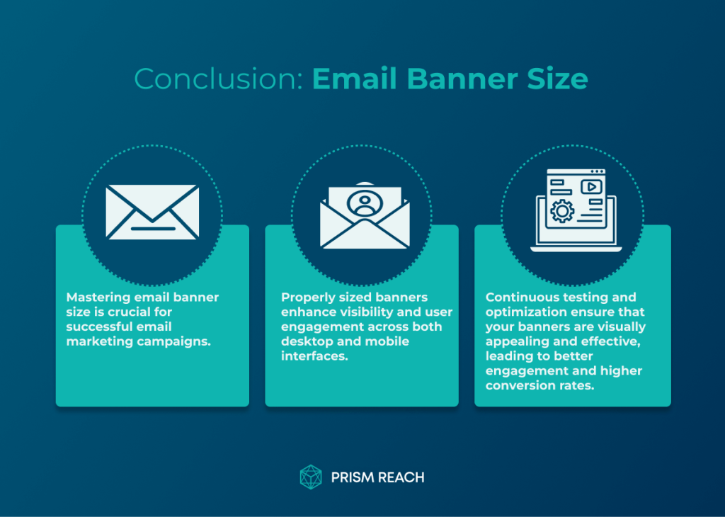
Conclusion
Mastering email banner sizes is a critical component of creating impactful and engaging email campaigns. By understanding the optimal dimensions, embracing responsive design, and incorporating best practices such as brand consistency, compelling visuals, and clear calls-to-action, you can elevate your email marketing efforts and achieve remarkable results.
Throughout this article, I have shared my insights and experiences, highlighting the importance of testing, personalization, accessibility, and continuous optimization. By implementing these strategies and staying attuned to the evolving landscape of email marketing, you can create banners that not only capture attention but also drive meaningful engagement and conversions.
Integrating advanced tools like Prism Reach further amplifies these strategies by providing enhanced personalization through AI, streamlined design management, and comprehensive performance monitoring. Prism Reach empowers businesses to create highly personalized and culturally relevant email marketing experiences that resonate with individual subscribers, leading to higher engagement, loyalty, and revenue growth.
Remember to continuously analyze and refine your banner strategy based on audience feedback and performance data. Stay up-to-date with the latest trends and best practices in your industry, and don’t be afraid to experiment with new tactics and formats to keep your audience engaged.
If you’re ready to take your email marketing to the next level, visit our website at https://prismreach.ai/ to learn more about how Prism Reach can help you achieve your goals. Start delivering the right content to the right people at the right time, and watch your engagement and revenue soar.
Sources
- MailMunch: Tips for Effective Email Banners
- Unlayer: Ideal Email Banner Size
- Simplified: Ultimate Guide to Email Banner Size
- DocHipo: Email Banner Size Guide