In the competitive realm of email marketing, standing out in a crowded inbox is paramount. One of the most effective ways to capture your subscribers’ attention is through a well-designed email header. The size of your email header image plays a crucial role in not only grabbing attention but also in conveying your brand’s message effectively. This comprehensive guide delves into the intricacies of email header image size, offering practical strategies and best practices to optimize your email campaigns for maximum engagement and conversion.
The Power of a Well-Sized Header Image
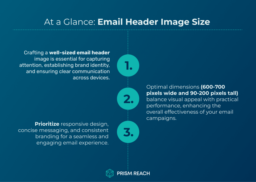
Does email header image size even matter? Absolutely! The header image is the first visual element your subscribers encounter when they open your email. It sets the tone, establishes your brand identity, and can significantly influence the overall effectiveness of your email campaign. A well-sized header image not only looks professional but also ensures that your message is conveyed clearly across various devices and email clients.
Consider this: a header that is too large may dominate the email, pushing essential content below the fold and requiring recipients to scroll excessively. Conversely, a header that is too small may fail to make an impact, leaving your email looking sparse and unengaging. Striking the right balance is key to creating a header that enhances your email’s visual appeal and functionality.
Pro Tip: Test Your Emails on Different Devices
Before sending out your email campaigns, it’s crucial to test how your header image appears on a range of devices and email clients. This proactive approach allows you to identify any potential display issues and make necessary adjustments to ensure optimal rendering across different screens and platforms.
By prioritizing testing, you can provide a seamless and enjoyable email experience for all your subscribers, regardless of their preferred device. Utilize tools like Litmus or Email on Acid to preview your emails on various devices and email clients, ensuring that your header image maintains its integrity and effectiveness.

Finding the Sweet Spot: Ideal Dimensions for Email Header Images
Through extensive research and practical experience, the recommended size for an email header image typically falls between 600 to 700 pixels in width and 90 to 200 pixels in height. This range provides ample space to showcase your logo, craft a compelling headline, and incorporate other essential visual elements without overwhelming the email’s content or compromising its performance.
However, these dimensions are not set in stone. Depending on your brand’s aesthetic and the nature of your content, you might find that adjusting these dimensions slightly can yield better results. Here are some key considerations:
- Width: While 600 pixels is the standard width, experimenting with widths up to 800 pixels can create a more visually appealing layout, especially on larger screens.
- Height: Testing different heights can lead to better visual impact. A taller header may provide more space for branding and messaging but should not overshadow the email content.
Critical Elements for Impactful Email Header Design
Creating an effective email header involves more than just selecting the right image size. Here are nine critical elements to consider:
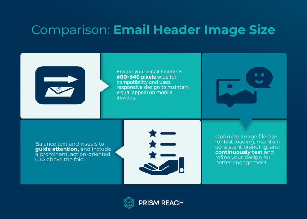
- Optimal Width for Compatibility: Aim for a width between 600 to 640 pixels to ensure compatibility across most email clients and devices, preventing the need for horizontal scrolling.
- Responsive Design for Mobile-Friendliness: Implement responsive design techniques to ensure your header scales proportionately on smaller screens, maintaining visual appeal and readability.
- Balancing Text and Visual Elements: Strike a balance between text and graphics to avoid overwhelming subscribers. Use visuals to complement your message.
- Establishing a Clear Visual Hierarchy: Use contrasting colors, varying font sizes, and strategic placement to emphasize key elements like your logo and call-to-action (CTA).
- Prominent and Actionable CTA Placement: Feature a clear and accessible CTA above the fold, using contrasting colors and action-oriented text.
- Concise and Impactful Messaging: Craft a compelling headline that communicates the main benefit or purpose of your email succinctly.
- Optimizing Image File Size for Fast Loading: Keep your header image file size below 100 KB to ensure quick loading without sacrificing quality.
- Maintaining Consistent Branding: Align your header design with your brand guidelines, using consistent colors, fonts, and visual elements.
- Testing and Refining: Conduct regular A/B tests to compare different header variations, using the insights to refine your design for better performance.
Incorporating these elements will help you create email headers that not only look great but also drive engagement and conversions.
Upgrade Your Email Marketing with AI Personalization!
Advanced Strategies: Hidden Gems for Optimizing Email Header Image Sizes
While the fundamental principles of email header design are widely recognized, there are several lesser-known strategies that can significantly enhance your email marketing effectiveness. Here are five hidden gem strategies to consider:
1. Experiment with Wider Headers
While the standard width for email headers is often cited as 600 pixels, experimenting with wider headers (up to 800 pixels) can create a more visually appealing layout. Wider images can enhance the design and allow for more impactful visuals, especially on larger screens.
- Potential Effectiveness: High
- Level of Obscurity: Moderate
- Ease of Implementation: Moderate
- Uniqueness: High
Using a wider header can provide more space for branding elements and key messages, making your email stand out. However, ensure that the increased width does not compromise compatibility with smaller screens.
2. Utilize Responsive Design Techniques
Ensure your email header images are responsive, meaning they adapt to different screen sizes. Using CSS media queries can help adjust the size of the header images based on the device, enhancing user experience on both mobile and desktop.
- Potential Effectiveness: High
- Level of Obscurity: Moderate
- Ease of Implementation: Moderate
- Uniqueness: High
Responsive design ensures that your header looks great on all devices, preventing issues like image distortion or excessive scaling.
3. Highlight Key Messages in Headers
Use your header image to convey key messages or promotions directly. This can be done through text overlays or by incorporating graphic elements that emphasize special offers, making it immediately clear what action you want recipients to take.
- Potential Effectiveness: High
- Level of Obscurity: Moderate
- Ease of Implementation: Moderate
- Uniqueness: High
By integrating key messages into your header, you can grab attention and guide subscribers towards desired actions from the moment they open your email.
4. Test Different Heights for Impact
While standard heights range from 100-200 pixels, testing different heights can lead to better visual impact. A taller header may provide more space for branding and messaging but should not overwhelm the email content.
- Potential Effectiveness: Moderate
- Level of Obscurity: High
- Ease of Implementation: Moderate
- Uniqueness: High
Experimenting with header height allows you to find the perfect balance between visibility and content prominence, ensuring your email remains engaging without being cluttered.
5. Use Background Images Wisely
Consider using background images in your headers instead of solid colors to create depth and interest. However, ensure that text overlays are readable against the background by using contrasting colors.
- Potential Effectiveness: Moderate
- Level of Obscurity: Moderate
- Ease of Implementation: Moderate
- Uniqueness: Moderate
Background images can make your headers more visually appealing, but it’s essential to maintain readability and ensure that the message remains clear.
Best Practices for Email Header Design
Implementing the right strategies for your email header design can significantly enhance your email marketing efforts. Here are some best practices to follow:
1. Optimal Width for Compatibility
When designing your email header, aim for a width between 600 to 640 pixels. This range has been proven to ensure compatibility across the vast majority of email clients and prevents the need for horizontal scrolling on desktop devices.
2. Responsive Design for Mobile-Friendliness
In today’s mobile-driven world, where more than half of all emails are opened on mobile devices, implementing responsive design techniques is essential. Ensure that your header image scales proportionately on smaller screens, maintaining visual appeal and readability without requiring users to zoom or scroll horizontally.
3. Balancing Text and Visual Elements
While header images play a vital role in capturing attention and setting the tone for your email, it’s important to strike a delicate balance between text and visual elements. Avoid overcrowding your header with too many graphic elements, as it can distract from your main message and overwhelm your subscribers.
Instead, use visuals strategically to complement your text, reinforce your brand identity, and guide the reader’s attention to key information.
4. Establishing a Clear Visual Hierarchy
An effective email header should have a clear visual hierarchy that guides the reader’s eye towards the most important elements in a logical and intuitive manner. Use contrasting colors, varying font sizes, and strategic placement to emphasize your logo, headline, and call-to-action.
5. Prominent and Actionable CTA Placement
Your email header should feature a prominent and easily accessible call-to-action (CTA) button that clearly communicates the desired action you want your subscribers to take. Place your CTA above the fold, ensuring that it’s visible without requiring the subscriber to scroll.
6. Concise and Impactful Messaging
To maximize the effectiveness of your email header, keep your messaging concise, clear, and impactful. Craft a compelling headline that immediately communicates the main benefit or purpose of your email, enticing subscribers to read further.
7. Optimizing Image File Size for Fast Loading
In the fast-paced world of email marketing, every second counts. To ensure optimal performance and fast loading times, it’s crucial to optimize your header image file size without compromising its visual quality. Utilize compression techniques and choose appropriate file formats (such as JPEG or PNG) to reduce the image’s size while maintaining its clarity and appeal.
8. Maintaining Consistent Branding
Consistency is key when it comes to building a strong and recognizable brand identity in the minds of your subscribers. Your email header should seamlessly align with your overall brand guidelines, incorporating consistent colors, fonts, and visual elements that reflect your brand’s unique personality and values.
9. Testing and Refining
To truly optimize the performance of your email header, it’s essential to embrace a culture of continuous testing and refinement. Conduct regular A/B tests to compare different header variations, analyzing their impact on key metrics such as open rates, click-through rates, and overall engagement.

Enhancing Your Email Marketing with Prism Reach
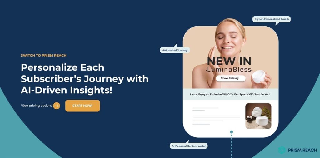
Optimizing your email header image size is just one aspect of creating impactful email campaigns. To take your email marketing efforts to the next level, consider leveraging advanced tools like Prism Reach, an innovative AI-powered SaaS solution designed to enhance the effectiveness of email marketing campaigns through deep personalization.
Key Benefits of Prism Reach
- Increased Engagement Through Personalization: Prism Reach uses sophisticated AI algorithms to customize every aspect of your newsletters based on subscriber behavior and preferences, resulting in up to 40% higher engagement rates.
- Higher Revenue via Tailored Advertising: The platform’s targeted advertising capabilities enable precise ad placements based on subscriber data, enhancing monetization opportunities for your email campaigns.
- Improved Productivity Through Automation: Automation features streamline content creation and campaign management, significantly reducing the time and effort required to produce and maintain effective email marketing strategies.
Prism Reach’s Advanced Features
Prism Reach offers a suite of features designed to simplify and enhance your email marketing efforts:
- AI-Powered Personalization: Clusters content into relevant categories and creates detailed user avatars for highly personalized newsletter content.
- Seamless Setup and Integration: Quick integration within 10 minutes with one-click uploads for existing subscriber lists.
- Dynamic Content Selection: AI determines the most relevant content for each subscriber, ensuring personalized and engaging newsletters.
- Advertising Network and Swap Network: Facilitates targeted advertising and mutual promotion among publishers to broaden content reach.
- Advanced AI Features: Includes anti-spam checks and focuses on high deliverability to maintain engagement levels and avoid spam filters.
Streamlined User Journey with Prism Reach
The typical user journey with Prism Reach involves a streamlined process where subscribers sign up through a customized form, select their interests, and then receive personalized newsletters that cater specifically to their preferences. This journey enhances user satisfaction and boosts the likelihood of long-term subscriber retention.
Compliance and Data Privacy
Prism Reach places a strong emphasis on GDPR compliance and hosts data within Europe, adhering to the highest standards of data protection. This focus on privacy is crucial for building trust with users and complying with international regulations.
Future Prospects
Looking ahead, Prism Reach aims to expand its technology into the eCommerce sector and explore new ways to leverage AI for broader marketing applications. The company is committed to the continuous improvement of its AI algorithms, ensuring that its solutions remain at the cutting edge of technology and marketing innovation.

Best Practices for Optimizing Email Header Image Size
Optimizing your email header image size involves a combination of adhering to best practices and experimenting with innovative strategies. Here are some actionable tips to help you master the art of email header design:
1. Choose the Right Dimensions
- Standard Width: 600-700 pixels
- Standard Height: 90-200 pixels
- Consider Wider Headers: Up to 800 pixels for more impactful visuals
2. Implement Responsive Design
- Use CSS media queries to adjust header size based on device
- Ensure readability and visual appeal on both mobile and desktop
- Test across various devices to maintain consistency
3. Optimize Image File Size
- Keep file size below 100 KB
- Use compression tools like TinyPNG or ImageOptim
- Choose appropriate file formats (JPEG or PNG)
4. Use Background Images Wisely
- Add depth and interest with background images
- Ensure text overlays are readable with contrasting colors
- Avoid overly busy backgrounds that distract from the message
5. Highlight Key Messages
- Incorporate text overlays to emphasize promotions or calls-to-action
- Use graphic elements to draw attention to key information
- Ensure that messages are clear and concise
Enhancing Your Strategy with Prism Reach
Prism Reach not only assists in optimizing your email header designs but also provides a comprehensive platform to elevate your entire email marketing strategy. By leveraging its AI-powered features, you can ensure that every aspect of your email—from the header image to the content—is tailored to your audience’s preferences and behaviors.
With Prism Reach, you gain access to:
- AI-Driven Insights: Understand subscriber behavior and preferences to inform your design and content decisions.
- Automated Personalization: Deliver highly personalized content that resonates with each subscriber, increasing engagement and loyalty.
- Comprehensive Analytics: Monitor the performance of your email campaigns in real-time, allowing for continuous optimization and improvement.

Conclusion
Optimizing your email header image size is a critical aspect of creating impactful and effective email campaigns. By understanding the ideal dimensions, implementing responsive design, and following best practices for visual hierarchy and branding, you can create headers that capture attention, convey your message effectively, and drive engagement.
Incorporating advanced strategies like experimenting with wider headers, highlighting key messages, and using background images wisely can further enhance the effectiveness of your email headers. Additionally, leveraging tools like Prism Reach can streamline your email marketing efforts, providing personalized and engaging content that resonates with your audience.
Remember to continuously test and refine your header designs to ensure they align with your marketing goals and resonate with your subscribers. With the right approach and the support of innovative tools like Prism Reach, you can elevate your email marketing campaigns to new heights, fostering stronger connections with your audience and achieving greater success.
Sources
- rasa.io – How to Choose the Right Email Newsletter Image Size
- Convesio – The Ultimate Guide to Email Header Size
- DocHipo – Email Banner Size Guide
- TeamTown – Email Header Design Tips
- SendX – Email Header Design Dos and Don’ts