In today’s digital age, email remains one of the most powerful tools for communication and marketing. A well-crafted email signature not only provides essential contact information but also serves as a branding opportunity. One crucial aspect of an effective email signature is the banner size. Choosing the right size ensures that your banner is visible, engaging, and compatible across various devices and email clients.
This comprehensive guide explores the ideal email signature banner size, best practices for design, and innovative strategies to enhance your email marketing efforts. Additionally, we will delve into how Prism Reach, an innovative AI-powered SaaS solution, can complement these strategies by enhancing email signature banners through deep personalization and advanced analytics.
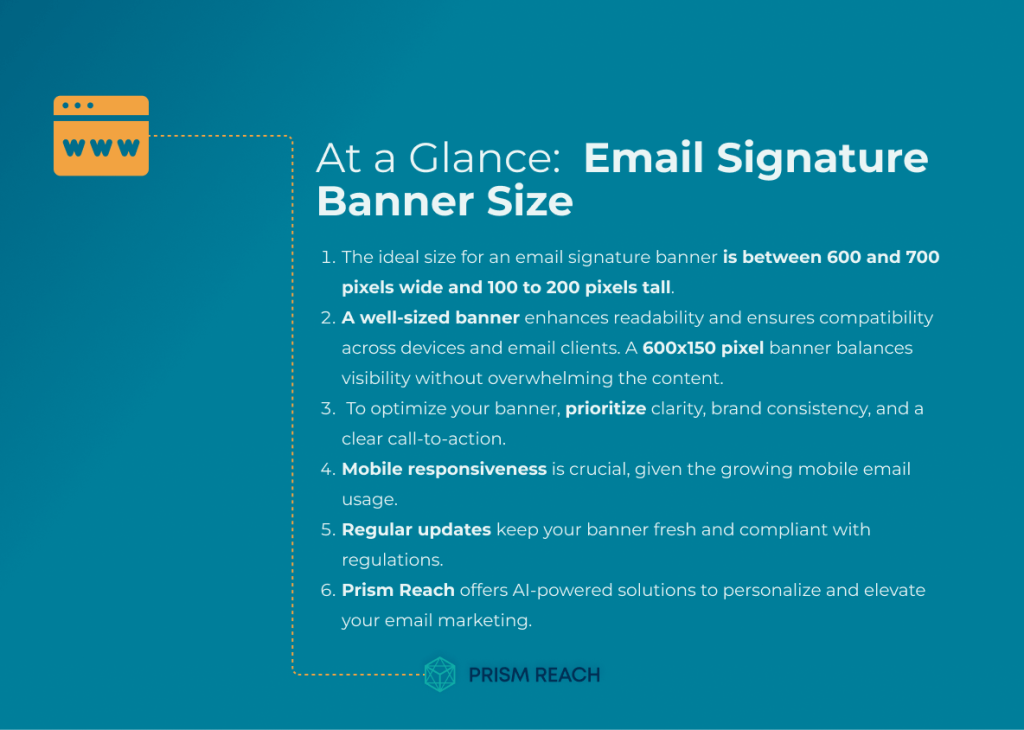
At a Glance
- Understanding the importance of banner size in email signatures.
- Integrating hidden gem strategies to enhance banner effectiveness.
- Leveraging Prism Reach for personalized and optimized email signatures.
- Best practices for designing email signature banners.
- Utilizing analytics to continuously improve banner performance. “Good Marketing makes the company look smart. Great Marketing makes the customer feel smart.” – Joe Chernov
Key Facts About Email Signature Banner Size
- Optimal banner size ensures visibility without overwhelming the email content.
- Responsive design is crucial for compatibility across various devices.
- Consistent branding in banners reinforces brand identity and recognition.
- Personalized banners can significantly increase engagement and click-through rates.
- Regular updates and A/B testing help maintain the effectiveness of banners.
Upgrade Your Email Marketing with AI Personalization!
Hidden Gem Strategies for Using Email Signature Banners
While the fundamental principles of email marketing are widely recognized, several lesser-known strategies can significantly enhance the effectiveness of your email signature banners. Here are five “hidden gem” strategies that can transform your email marketing campaigns:
1. Dynamic Content in Banners
Utilize dynamic content in your email signature banners that changes based on the recipient’s data or behavior. For example, display personalized promotions or messages tailored to specific segments of your audience.
- Potential Effectiveness: High
- Level of Obscurity: Moderate
- Ease of Implementation: Moderate
- Uniqueness: High
By leveraging Prism Reach’s AI capabilities, you can automate the personalization of your banners, ensuring each recipient sees content that is relevant to their interests and behavior. This personalization can lead to higher engagement and conversion rates.
2. Incorporate Interactive Elements
Add interactive elements such as clickable buttons or links within your banner. This can increase engagement by encouraging recipients to take specific actions, like visiting a website or signing up for an event.
- Potential Effectiveness: High
- Level of Obscurity: High
- Ease of Implementation: Moderate
- Uniqueness: High
Interactive elements make your email signature banners more engaging and can drive direct actions from your recipients. Prism Reach can analyze which interactive elements perform best, allowing you to refine your banners for maximum impact.
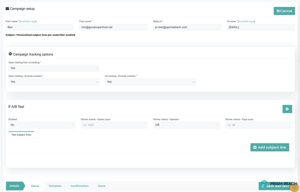
3. A/B Testing for Banner Designs
Conduct A/B testing on different banner designs to determine which visuals, colors, and messages resonate best with your audience. This data-driven approach can help refine future campaigns.
- Potential Effectiveness: High
- Level of Obscurity: Moderate
- Ease of Implementation: Moderate
- Uniqueness: Moderate
Prism Reach’s analytics tools allow you to track the performance of different banner designs, providing actionable insights that inform your A/B testing strategies. This ensures that your banners are continuously optimized for the best results.
4. Highlight Customer Testimonials
Incorporate customer testimonials or success stories into your banners. This builds trust and credibility, making recipients more likely to engage with your brand.
- Potential Effectiveness: High
- Level of Obscurity: Moderate
- Ease of Implementation: Easy
- Uniqueness: Moderate
Featuring real customer experiences in your email signature banners not only enriches the content but also fosters a sense of community and authenticity. Prism Reach can help select the most impactful testimonials based on subscriber preferences.
5. Optimize for Mobile Devices
Design your email signature banners to be responsive so they display correctly on mobile devices. This ensures that all recipients have a good experience regardless of how they access their emails.
- Potential Effectiveness: High
- Level of Obscurity: Moderate
- Ease of Implementation: Moderate
- Uniqueness: High
With the increasing prevalence of mobile email consumption, mobile optimization is crucial. Prism Reach can analyze device-specific engagement metrics, helping you fine-tune your banners for optimal mobile performance.
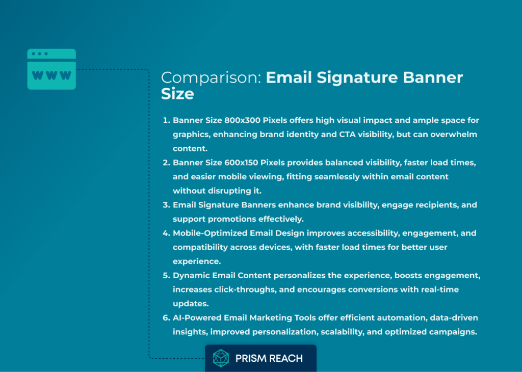
Comparison: Email Signature Banner Size
1. Banner Sizes
- Banner Size 800×300 Pixels
Advantages:- High visual impact and ample space for detailed graphics and text
- Strong brand emphasis and enhanced call-to-action (CTA) visibility
- Offers versatile design options for complex, creative layouts
Disadvantages: - Can overwhelm the email content by pushing important information below the fold
- May require excessive scrolling, particularly on mobile devices
- Banner Size 600×150 Pixels
Advantages:- Provides balanced visibility without dominating the email layout
- Better suited for mobile viewing with quicker load times
- Helps maintain a clean, uncluttered email structure
Disadvantages: - Limited space for detailed information and design elements
- May have reduced visual impact compared to larger banners
2. Email Signature Banner
Advantages:
- Enhances overall brand visibility and reinforces company identity
- Engages recipients by clearly promoting offers or events
- Integrates contact details and social media links seamlessly
Disadvantages:
- Risk of triggering spam filters if the image is too large
- More complex design challenges, balancing visuals with text content
3. Mobile-Optimized Email Design
Advantages:
- Improves accessibility and ensures compatibility across various devices
- Increases recipient engagement and promotes faster load times
- Enhances the overall user experience with a design tailored for mobile viewing
Disadvantages:
- Limited screen space may restrict complex designs
- Some design elements might not scale perfectly, potentially causing layout issues
4. Dynamic Email Content
Advantages:
- Offers a personalized experience by tailoring content to individual preferences
- Boosts engagement and increases click-through rates with timely, relevant information
- Encourages conversions by reflecting real-time updates and customized CTAs
Disadvantages:
- Requires access to sufficient and accurate user data
- Can be more challenging to implement due to its complexity
5. AI-Powered Email Marketing Tools
Advantages:
- Automates processes efficiently, saving time and effort
- Provides valuable data-driven insights for optimizing campaigns
- Enhances personalization and scales to accommodate growing subscriber lists
Disadvantages:
- High initial costs may be a barrier to adoption
- The effectiveness depends heavily on the quality of the data available
6. Interactive Email Features
Advantages:
- Increases recipient engagement through interactive elements
- Boosts click rates by encouraging direct interaction with the email
- Offers real-time feedback and differentiates emails from more traditional formats
Disadvantages:
- Not all email clients support interactive elements, leading to compatibility issues
- Additional interactive features may slow down the email’s loading time
7. Branding Elements
- Your Company Logo
Advantages:- Reinforces brand identity and creates a professional, instantly recognizable look
- Contributes to consistent branding across all emails
Disadvantages: - Can occupy valuable design space
- May impose restrictions on creative design flexibility
- A Compelling Tagline
Advantages:- Quickly conveys the brand’s core message and values
- Differentiates the brand and supports overall branding efforts
Disadvantages: - Limited space might require sacrificing other design elements
- If too vague, it could confuse recipients
8. Contact Information and Social Media Integration
- Contact Information
Advantages:- Facilitates communication and enhances the credibility of the email
- Improves reachability and directs recipients to the appropriate channels
Disadvantages: - Can lead to a cluttered look if not designed carefully
- Needs regular updating to avoid outdated information
- Social Media Icons
Advantages:- Expands the digital presence and promotes engagement across different platforms
- Strengthens the online community and drives additional traffic
Disadvantages: - Adds design complexity and may distract from the main message
- Risk of cluttering the overall layout
9. Clear Call-to-Action (CTA)
Advantages:
- Drives recipient actions by clearly guiding them on what to do next
- Enhances engagement and improves conversion rates
- Simplifies navigation with a direct, easy-to-follow instruction
Disadvantages:
- Aggressive CTAs can sometimes come across as pushy
- Space constraints might limit how much additional content can be included
10. Personalization with Dynamic Content
Advantages:
- Tailors the experience to each recipient, increasing engagement and response rates
- Enhances the relevance of the email by delivering content that feels personal
- Improves overall user experience by making the communication feel more targeted
Disadvantages:
- Requires advanced data management and integration, complicating implementation
- Raises potential privacy concerns related to user data handling
11. Mobile Responsiveness
Advantages:
- Ensures that emails are easily readable and accessible on any device
- Increases reach by catering to mobile users and reducing viewing friction
- Enhances the user experience by optimizing the layout for small screens
Disadvantages:
- May impose design constraints that limit creativity
- Requires thorough testing across various devices and platforms to ensure consistency
12. Compliance with Email Regulations
Advantages:
- Builds trust with recipients by showing a commitment to legal standards
- Helps avoid penalties and improves email deliverability
- Ensures transparency through clear unsubscribe options and privacy information
Disadvantages:
- The formal tone required can sometimes make emails feel less personal
- Requires regular updates to remain compliant with evolving regulations
13. Regular Updates
Advantages:
- Keeps content fresh, timely, and relevant to current promotions or offers
- Enhances recipient engagement by reflecting seasonal or new information
- Supports ongoing marketing strategies with adaptable design options
Disadvantages:
- Increases the workload as content needs to be updated consistently
- May disrupt design uniformity if updates are not managed carefully
Best Practices for Designing Email Signature Banners
Creating an effective email signature banner involves more than just choosing the right size. Here are some best practices to follow:
1. Use Visual Hierarchy Effectively
- Implement a clear visual hierarchy using different font sizes, colors, and spacing to guide readers through the content.
- Prioritize information to make it easier for readers to digest.
- Ensure that the most important elements, such as CTAs, stand out visually.
A clear visual hierarchy helps in organizing the content, making it easier for subscribers to navigate and engage with the banner. By strategically placing key elements, you guide the reader’s attention to the most important parts of your email signature.
2. Incorporate Clear Calls-to-Action (CTAs)
- Ensure that your banners have strategically placed CTAs that are visually distinct.
- Clearly convey the desired action to improve click-through rates.
- Use actionable language that prompts immediate response.
Effective CTAs are crucial for driving conversions. They should be easy to find and understand, encouraging subscribers to take the next step, whether it’s visiting your website, signing up for a webinar, or downloading a resource.
3. Maintain Consistent Branding
- Keep your email signature banners consistent with your overall branding strategy by using the same colors, fonts, and logos.
- Reinforce brand identity and help subscribers recognize your emails immediately.
- Ensure that all elements align with your brand’s visual guidelines.
Consistent branding in your email signature banners reinforces brand identity and recognition. This consistency helps build trust and familiarity with your audience, making your communications more effective.
Enhancing Your Email Marketing with Prism Reach
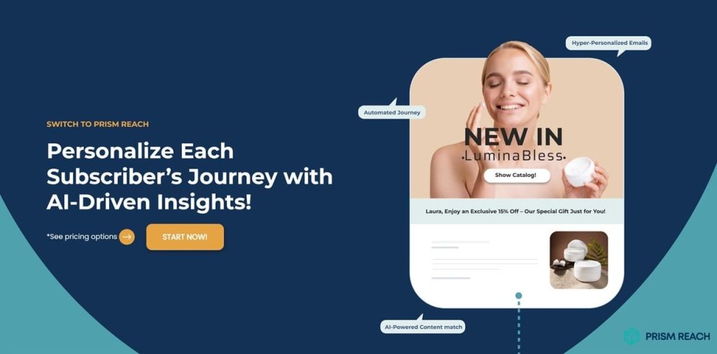
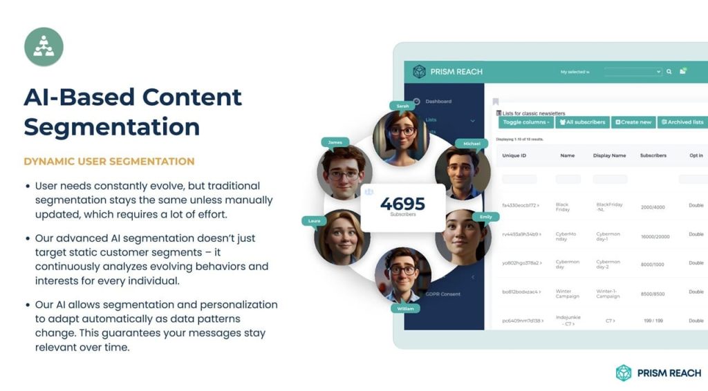
While mastering the use of email signature banners is essential, leveraging advanced tools like Prism Reach can take your email marketing efforts to the next level. Prism Reach is an innovative AI-powered SaaS solution designed to enhance the effectiveness of email marketing campaigns through deep personalization and advanced analytics. This platform complements the strategies outlined above, providing a seamless and highly personalized email marketing experience.
Key Benefits of Prism Reach
- Enhanced Personalization: Prism Reach uses sophisticated AI algorithms to customize every aspect of your email signatures based on recipient behavior and preferences, resulting in more engaging and relevant communications.
- Automated Proofreading and Tone Adjustment: The platform’s AI-driven tools help ensure your banners are error-free and maintain a professional tone, reducing the risk of miscommunication.
- Comprehensive Analytics: Prism Reach provides detailed analytics on banner performance, helping you understand what works and where improvements are needed to enhance your email communications.
Prism Reach’s Advanced Features
Prism Reach offers a suite of features designed to streamline and enhance your email signature banners:
- AI-Powered Personalization: Clusters content into relevant categories and creates detailed user avatars for highly personalized banner content.
- Seamless Setup and Integration: Quick integration within minutes with one-click uploads for existing contact lists.
- Dynamic Content Selection: AI determines the most relevant content for each recipient, ensuring your banners are tailored and engaging.
- Automated Proofreading: Identifies and corrects spelling, grammar, and punctuation errors to maintain professionalism.
- Tone Analysis: Assesses the tone of your banners and provides suggestions to ensure your message is clear and respectful.
- Comprehensive Analytics: Tracks banner performance metrics, offering insights into engagement rates and click-through rates.
Streamlined User Journey with Prism Reach
The typical user journey with Prism Reach involves a streamlined process where you set up your account, import your contact list, and begin crafting personalized email signatures with the help of AI-driven tools. Subscribers receive tailored messages that resonate with their preferences and behaviors, enhancing their experience and increasing the likelihood of positive interactions.
Compliance and Data Privacy
Prism Reach places a strong emphasis on GDPR compliance and hosts data within secure, European servers, adhering to the highest standards of data protection. This focus on privacy is crucial for building trust with your recipients and ensuring that your email communications comply with international regulations.
Future Prospects
Looking ahead, Prism Reach aims to expand its capabilities by integrating more advanced AI features and expanding into new sectors such as eCommerce. The company is committed to continuous improvement, ensuring that its solutions remain at the forefront of email marketing technology and innovation.

Maximizing Email Marketing Effectiveness with Prism Reach
Email marketing remains one of the most effective channels for nurturing leads, driving conversions, and fostering long-lasting customer relationships. Prism Reach can help you craft compelling email signature banners that resonate with your subscribers, ensuring higher engagement and click-through rates.
Prism Reach Integration Benefits
Integrating Prism Reach into your email signature strategy offers several benefits:
- Personalized Engagement: Tailor banner content to individual subscriber preferences, enhancing relevance and interaction.
- Automated Optimization: Utilize AI to automatically adjust banner designs and content for optimal performance across devices.
- Data-Driven Insights: Leverage comprehensive analytics to understand banner effectiveness and refine your strategies accordingly.
By harnessing these benefits, Prism Reach ensures that your email signature banners are not only visually appealing but also strategically effective in driving engagement and conversions.
Conclusion
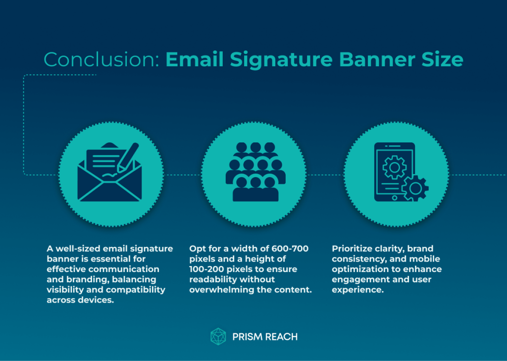
Crafting the perfect email signature banner involves finding the right size, design, and elements to make a lasting impact. By following the guidelines and tips outlined in this article, you can create an email signature banner that not only looks professional but also effectively promotes your brand and encourages engagement.
Remember, your email signature is a powerful marketing tool that reaches every recipient you communicate with. Make the most of this opportunity by optimizing your banner size and incorporating essential elements that leave a memorable impression.
For those seeking to revolutionize their email marketing strategy, Prism Reach is the go-to solution. With its AI-driven personalization, advanced analytics, and user-friendly interface, Prism Reach simplifies the process of creating highly targeted and effective email signature banners. Elevate your email game and experience the power of personalized marketing with Prism Reach.
In a world where countless emails compete for attention, a well-crafted email signature banner can be the differentiating factor that sets you apart. By mastering the perfect banner size and incorporating the right elements, you can create a signature that not only informs but also captivates and inspires action.
So, take the time to refine your email signature banner and unlock its full potential. Your recipients will appreciate the effort, and your brand will reap the benefits of increased engagement and loyalty. Start optimizing your banner today and watch your email marketing soar to new heights.
Sources
- Rocketseed – Email Signature Banners for Marketing
- WordStream – Email Signature Examples and Trends
- Mailtastic – Email Signature Examples
- Privy – Email Banner Design Tips
- Right Inbox – Best Practices for Email Signatures